Case Study: Designing a Thoughtful Travel Experience for the Modern Explorer
|
Aman Ansari
Introduction
In this project, we undertook our first full-scale UI-UX driven design endeavor - and it become a mix of storytelling, thoughtful design and technical precision.
Client: Travel Tours (hypothetical) approached us with an ambitious challenge: "Can you help us create a website which reflect a digital experience that feels like travel itself - especially for the people visiting Japan?” They didn’t want just another travel website, they want an experience that is living, breathing and something that reflects the mood and mindfulness of planning a culturally immersive trip. In this case study captures our approach — from concept to execution — and highlights how this project helped shape our design philosophy.
Table Of Content
Project Overview
In this project, we undertook our first full-scale UI-UX driven design endeavor - and it become a mix of storytelling, thoughtful design and technical precision.
Client: Travel Tours (hypothetical) approached us with an ambitious challenge: "Can you help us create a website which reflect a digital experience that feels like travel itself - especially for the people visiting Japan?” They didn’t want just another travel website, they want an experience that is living, breathing and something that reflects the mood and mindfulness of planning a culturally immersive trip. In this case study captures our approach from concept to execution and highlights how this project helped shape our design philosophy.
Problem Statement
Most users plan their travel while juggling multiple tasks with multiple apps- one for weather another for packing items, blogs for info, booking, etc. This fragmentation often kills the joy and curiosity that comes with preparing for a trip.
The client noticed a recurring problem:
Travelers heading to destination like Japan often don’t know what to pack for the season or region.
They look for trustworthy, minimalist recommendations, not bloated “Top 100” blog lists.
There was no single platform that merges personalization, cultural depth, and design calmness.
What Travel Tours(hypothetical) Wanted :
They envisioned a calm, inspiring, intelligent website, something that encourages travelers to prepare mindfully. Their goals were:
A visually immersive homepage that evokes curiosity and calmness
An AI-powered Smart Packing List Generator tailored by city, season, and travel style
A dynamic blog section to guide users through essentials, stories, and cultural tips
A scroll-based journey instead of rigid sections
A responsive, mobile-first, clean and human experience
A distinct visual identity, something users would remember even after their trip was over
How We Delivered It :
Our team approached the design challenge from both emotional and functional perspectives. We aimed to blend intuitive UX with aesthetic minimalism.
UX Features That Brought It to Life
1. Immersive Scroll-Based Landing Flow
We designed a cinematic scroll based landing page that create a storytelling that led the user connect to the product itself. Instead of overwhelming users with menus or CTAs at the start, we let them flow naturally through subtle transitions, delicate typography, and visual storytelling.
Soft parallax movement simulates a journey
Custom scroll pacing (Framer-powered) to create breathing space
Fonts inspired by Japanese editorial layouts paired with sans-serif UI clarity
This created an emotion-first impression, perfect for the target audience seeking depth in travel.
2. Unique Landing Section
Instead of dropping users into a sea of text, we welcomed them with a poetic phrase floating on full-screen image, changing dynamically based on destinations.
This gives the user to interact with the website and explore multiple options based on their preferences.
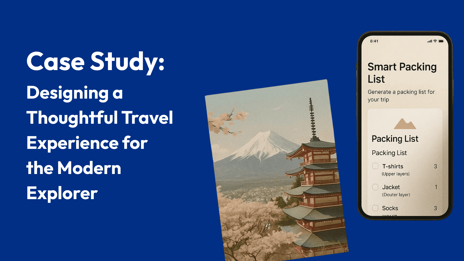
3. AI-Powered Smart Packing List Generator
One of the most technical and challenging part of the project is creating an AI Smart Tool to create packing list based on travel type, city, month, etc.
How we did it:
To reduce turn around time we use ChatGPT for writing a custom code to build the Smart Tool for the prototype version and then integrating it in Framer Design.
How it works:
User selects their city, month, and travel style (solo, couple, luxury, minimalist, etc.)
The system generates a customized packing list, curated through our custom API backed by a content database and AI logic
Includes real-time suggestions for weather-based gear, traditional etiquette-based needs (like temple wear), and smart travel hacks]
UX Wins:
Fully responsive dropdown flow
State-based feedback animations
PDF download with clean, printable formatting
Error handling and “reset” interaction design
This was more than just a feature, it became a signature utility that turned the website into a travel assistant.
4. Engaging Blog Section
The client emphasized that content would be their long-term differentiator. So we designed a CMS Blog System that was:
Fully modular and easy to expand
Beautiful on both desktop and mobile
Featuring travel guides, seasonal checklists, etiquette tips, and local cuisine spotlights
We also added hover-states, soft transitions, and scroll reveals to keep the experience cohesive with the main landing flow.
5. Built with Performance and Elegance
We built the platform using Framer, leveraging its modern front-end architecture to keep the site light, fast, and interactive. Every detail from button shadows to scroll resistance was polished for touch and clarity.
Mobile-first wasn’t just a design choice; it was a necessity. Our layout passed multiple breakpoint tests and user sessions to ensure comfort during thumb-based browsing.
UX Process in Phases
1. Discovery & Research
Created traveler personas (e.g., Solo Explorer, Conscious Couple, Seasonal Enthusiast)
Researched packing patterns for Japan across spring, summer, monsoon, and winter
Studied emotional design principles to create a calm-first web experience
2. Wireframes & Narrative Design
Designed low-fidelity frames to sketch out the scroll pacing and utility flow
Mapped key interaction points for the Packing List Tool
Storyboarded blog and landing to follow a soft-conversion rhythm
3. Visual Design
Selected an editorial-inspired layout with plenty of negative space
Used natural textures, analog paper tones, and season-based illustrations
Created component libraries in Figma for development consistency
4. Development & API Integration
Used Framer's CMS and interactions engine for micro-animations
Built and integrated the Packing List API from scratch
Ran internal testing across devices and browsers for polish
What We Learned
This project was more than a delivery, it was our first milestone as UI/UX designer.
Here’s what it taught us:
1. Emotionally-Driven UX is a Differentiator
When users feel something in the first scroll, they stay longer. A good product solves problems. A great product also tells a story.
2. Less is More
Whitespace, soft color palettes, restrained typography. These don't limit impact. They amplify it. We learned to embrace visual silence.
3. Functional Design Must Be Invisible
The AI tool needed to be powerful — but felt simple. Users shouldn’t have to “think” about interface, they should glide through it.
4. Full-Cycle Product Thinking
We didn't just design pages we thought in flows, edge cases, loading states, and content scaling. That mindset shift made all the difference.
Final Thoughts
Travel Tours (hypothetical) company gave us a rare opportunity:
To create a website that doesn’t just sell travel but feels like travel. Although we didn’t get a chance to make it live due to whatever reasons, it became a canvas where emotional storytelling, smart personalization, and frictionless design came together. From scroll motion to AI integration we didn’t just ship a website; we built an experience.
And for us, it was the beginning of something exciting, a commitment to design not just for function, but for feeling.
Project Overview
In this project, we undertook our first full-scale UI-UX driven design endeavor - and it become a mix of storytelling, thoughtful design and technical precision.
Client: Travel Tours (hypothetical) approached us with an ambitious challenge: "Can you help us create a website which reflect a digital experience that feels like travel itself - especially for the people visiting Japan?” They didn’t want just another travel website, they want an experience that is living, breathing and something that reflects the mood and mindfulness of planning a culturally immersive trip. In this case study captures our approach from concept to execution and highlights how this project helped shape our design philosophy.
Problem Statement
Most users plan their travel while juggling multiple tasks with multiple apps- one for weather another for packing items, blogs for info, booking, etc. This fragmentation often kills the joy and curiosity that comes with preparing for a trip.
The client noticed a recurring problem:
Travelers heading to destination like Japan often don’t know what to pack for the season or region.
They look for trustworthy, minimalist recommendations, not bloated “Top 100” blog lists.
There was no single platform that merges personalization, cultural depth, and design calmness.
What Travel Tours(hypothetical) Wanted :
They envisioned a calm, inspiring, intelligent website, something that encourages travelers to prepare mindfully. Their goals were:
A visually immersive homepage that evokes curiosity and calmness
An AI-powered Smart Packing List Generator tailored by city, season, and travel style
A dynamic blog section to guide users through essentials, stories, and cultural tips
A scroll-based journey instead of rigid sections
A responsive, mobile-first, clean and human experience
A distinct visual identity, something users would remember even after their trip was over
How We Delivered It :
Our team approached the design challenge from both emotional and functional perspectives. We aimed to blend intuitive UX with aesthetic minimalism.
UX Features That Brought It to Life
1. Immersive Scroll-Based Landing Flow
We designed a cinematic scroll based landing page that create a storytelling that led the user connect to the product itself. Instead of overwhelming users with menus or CTAs at the start, we let them flow naturally through subtle transitions, delicate typography, and visual storytelling.
Soft parallax movement simulates a journey
Custom scroll pacing (Framer-powered) to create breathing space
Fonts inspired by Japanese editorial layouts paired with sans-serif UI clarity
This created an emotion-first impression, perfect for the target audience seeking depth in travel.
2. Unique Landing Section
Instead of dropping users into a sea of text, we welcomed them with a poetic phrase floating on full-screen image, changing dynamically based on destinations.
This gives the user to interact with the website and explore multiple options based on their preferences.
3. AI-Powered Smart Packing List Generator
One of the most technical and challenging part of the project is creating an AI Smart Tool to create packing list based on travel type, city, month, etc.
How we did it:
To reduce turn around time we use ChatGPT for writing a custom code to build the Smart Tool for the prototype version and then integrating it in Framer Design.
How it works:
User selects their city, month, and travel style (solo, couple, luxury, minimalist, etc.)
The system generates a customized packing list, curated through our custom API backed by a content database and AI logic
Includes real-time suggestions for weather-based gear, traditional etiquette-based needs (like temple wear), and smart travel hacks]
UX Wins:
Fully responsive dropdown flow
State-based feedback animations
PDF download with clean, printable formatting
Error handling and “reset” interaction design
This was more than just a feature, it became a signature utility that turned the website into a travel assistant.
4. Engaging Blog Section
The client emphasized that content would be their long-term differentiator. So we designed a CMS Blog System that was:
Fully modular and easy to expand
Beautiful on both desktop and mobile
Featuring travel guides, seasonal checklists, etiquette tips, and local cuisine spotlights
We also added hover-states, soft transitions, and scroll reveals to keep the experience cohesive with the main landing flow.
5. Built with Performance and Elegance
We built the platform using Framer, leveraging its modern front-end architecture to keep the site light, fast, and interactive. Every detail from button shadows to scroll resistance was polished for touch and clarity.
Mobile-first wasn’t just a design choice; it was a necessity. Our layout passed multiple breakpoint tests and user sessions to ensure comfort during thumb-based browsing.
UX Process in Phases
1. Discovery & Research
Created traveler personas (e.g., Solo Explorer, Conscious Couple, Seasonal Enthusiast)
Researched packing patterns for Japan across spring, summer, monsoon, and winter
Studied emotional design principles to create a calm-first web experience
2. Wireframes & Narrative Design
Designed low-fidelity frames to sketch out the scroll pacing and utility flow
Mapped key interaction points for the Packing List Tool
Storyboarded blog and landing to follow a soft-conversion rhythm
3. Visual Design
Selected an editorial-inspired layout with plenty of negative space
Used natural textures, analog paper tones, and season-based illustrations
Created component libraries in Figma for development consistency
4. Development & API Integration
Used Framer's CMS and interactions engine for micro-animations
Built and integrated the Packing List API from scratch
Ran internal testing across devices and browsers for polish
What We Learned
This project was more than a delivery, it was our first milestone as UI/UX designer.
Here’s what it taught us:
1. Emotionally-Driven UX is a Differentiator
When users feel something in the first scroll, they stay longer. A good product solves problems. A great product also tells a story.
2. Less is More
Whitespace, soft color palettes, restrained typography. These don't limit impact. They amplify it. We learned to embrace visual silence.
3. Functional Design Must Be Invisible
The AI tool needed to be powerful — but felt simple. Users shouldn’t have to “think” about interface, they should glide through it.
4. Full-Cycle Product Thinking
We didn't just design pages we thought in flows, edge cases, loading states, and content scaling. That mindset shift made all the difference.
Final Thoughts
Travel Tours (hypothetical) company gave us a rare opportunity:
To create a website that doesn’t just sell travel but feels like travel. Although we didn’t get a chance to make it live due to whatever reasons, it became a canvas where emotional storytelling, smart personalization, and frictionless design came together. From scroll motion to AI integration we didn’t just ship a website; we built an experience.
And for us, it was the beginning of something exciting, a commitment to design not just for function, but for feeling.
Table Of Content