Designing for iOS: How Apple’s HIG Changed the Way I Think About UI
Jun 12, 2025
|
Viraj Singh
I’ve been developing mobile applications in Flutter for about three years now. Over that time, I’ve built a wide range of UIs — from eCommerce and medical apps to grocery, home automation, and HR management systems. But I’ve always had this curiosity about SwiftUI — Apple’s modern way of building native iOS apps.
At Ambibuzz, the company I work for, we have a two-day “learning window” in each two-week sprint (thank you, Ambibuzz!). My team lead and I decided to make use of that time to finally dive into SwiftUI.
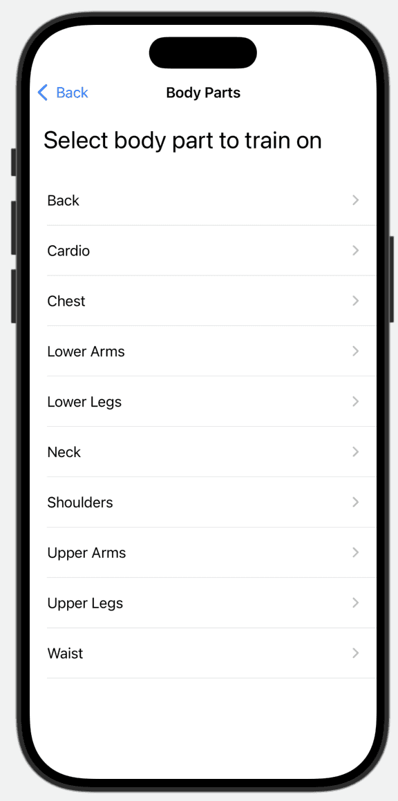
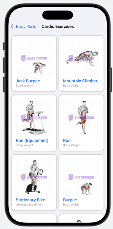
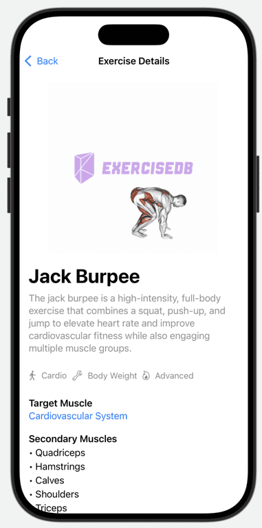
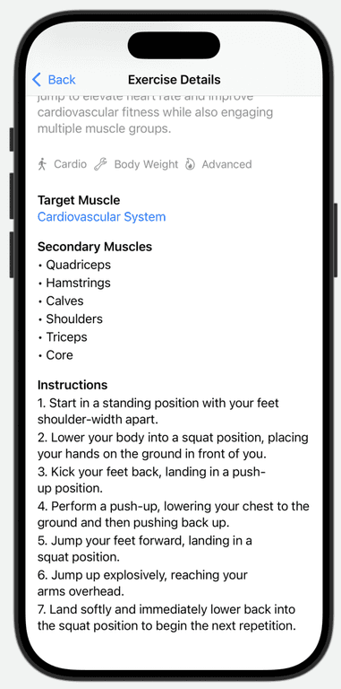
Instead of building something random, I wanted to create something that was not only useful but also beautiful — and that’s how AmbiPlay was born: a fitness helper app where users can explore exercises for different body parts, get detailed instructions, and view animated GIFs for form guidance.
Coming from a Flutter background, where Material Design is the default and deep UI customization is second nature, I expected SwiftUI to require similar effort. But to my surprise, Apple’s Human Interface Guidelines (HIG) completely changed how I thought about UI design.
SwiftUI made the whole experience feel smooth, elegant, and effortless. It was like working with a UI that already knew how to be beautiful — like a beautiful lady who doesn’t need no makeup. It just… worked. And it completely reshaped my perspective on design principles, platform defaults, and user experience.
AmbiPlay UI Flow
Home Screen
The app begins with a clean and inviting home screen that immediately sets the tone — simple, intuitive, and visually pleasant. From there, users can explore exercises based on body parts or specific target muscles.

Body Part Selection
Users can choose to view exercises based on different body parts like chest, back, arms, or legs.

Target Muscles View
You can also dive deeper and explore exercises for very specific target muscles. The categorization helps narrow down exactly what users want to train.

Exercises Grid
Once a body part is selected, the user is presented with a grid of exercises tailored to that region. Each card includes a GIF preview, exercise name, and the equipment used.

Exercise Description
The description screen offers everything a user might need:
A high-quality GIF showing the correct form
Target and secondary muscles involved
Step-by-step instructions
Equipment used
The layout keeps everything digestible without overwhelming the user. SwiftUI’s natural hierarchy and padding make this screen shine without excessive customization. It felt like the design was leading me rather than the other way around.


HIG vs Material: A Paradigm Shift
In Flutter/Material Design:
You often start from scratch and layer in your design choices.
You're encouraged to customize, extend, and build UIs however you imagine.
The philosophy supports creative freedom — sometimes at the expense of consistency.
In SwiftUI with HIG:
You start with well-thought-out defaults that already feel native.
You’re gently nudged toward simplicity, clarity, and focus.
The system discourages over-customization, guiding you to make apps that feel like part of iOS, not just installed on iOS.
This shift made me rethink how I approach design:
Do I really need to customize that button?
Can whitespace alone guide the user?
Is adding one more icon helping or hurting?
What I Built: AmbiPlay
The app allows users to:
Browse exercises by body part (e.g., back, chest, cardio)
View each exercise with a clean GIF animation
Read step-by-step instructions
Understand the equipment and muscles involved
The experience of building AmbiPlay with SwiftUI was nothing short of delightful. The framework handled responsiveness, animation, and layout gracefully — with less boilerplate and more declarative logic.
What I Learned
Less is more: SwiftUI and HIG taught me that good design often comes from restraint, not addition.
Defaults matter: Apple’s default styling often just works. You don’t always need to override it.
System consistency builds trust: Following HIG made my app feel like a native extension of the OS.
Final Thoughts
If you’re coming from Flutter or any cross-platform background, I highly recommend diving into SwiftUI and reading Apple’s Human Interface Guidelines. Not only will it help you build better apps for iOS, but it’ll also change the way you think about design — in the best way possible.
Thanks to Ambibuzz for supporting learning time — it led to a week of inspiration and a fresh perspective I’ll carry into all my future projects.