10 Powerful UX Laws Every Designer Should Know (with Real App Examples)
|
Aman Ansari

Introduction
Great UX isn’t just about making things look good — it’s about understanding how users think and behave. Many of the world’s best digital products follow time-tested psychological principles that guide user actions and decisions.
Here are 10 essential UX laws and principles, explained with real-world examples, that every designer should have in their toolkit.
Table Of Content
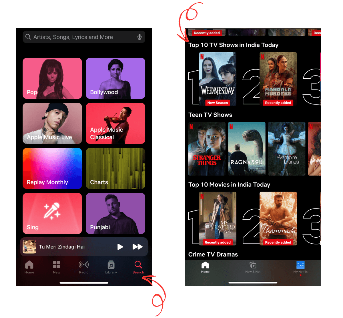
1. Hick’s Law
The more choices, the longer the decision time.
Users make faster decisions when faced with fewer options. For example, Apple Music streamlines navigation with a minimal number of tabs, while Netflix promotes trending content upfront to help users choose without overthinking.
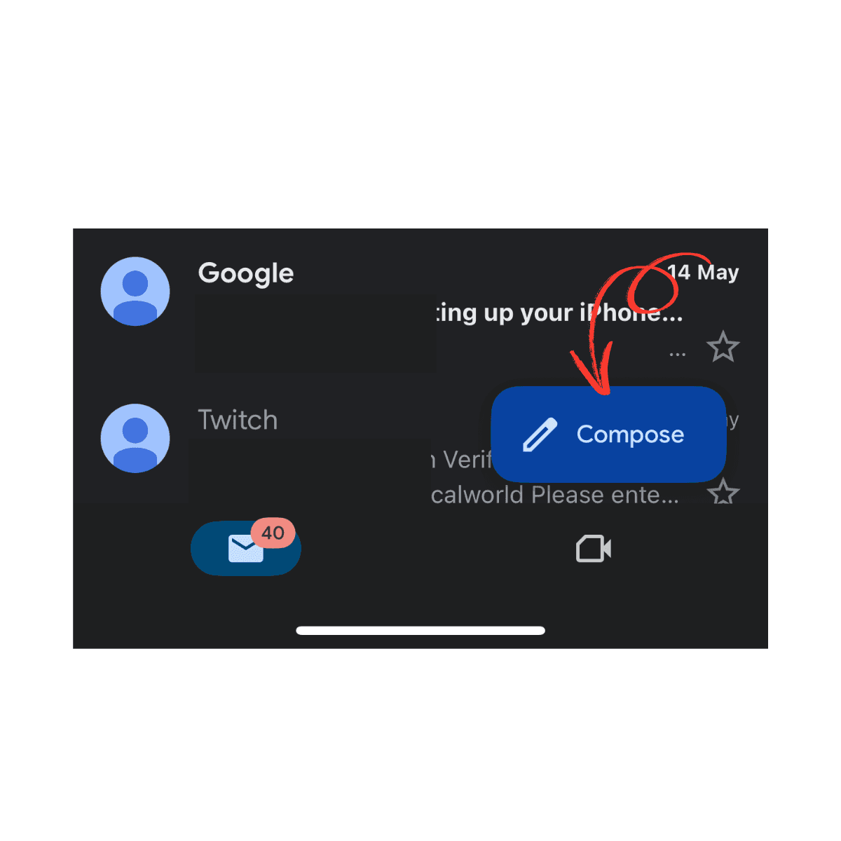
2. Fitts’s Law
Bigger and closer elements are easier to click or tap.
Gmail’s large, prominently placed Compose button is a perfect example. It’s easy to find and effortless to tap, especially on mobile devices, enhancing user satisfaction.
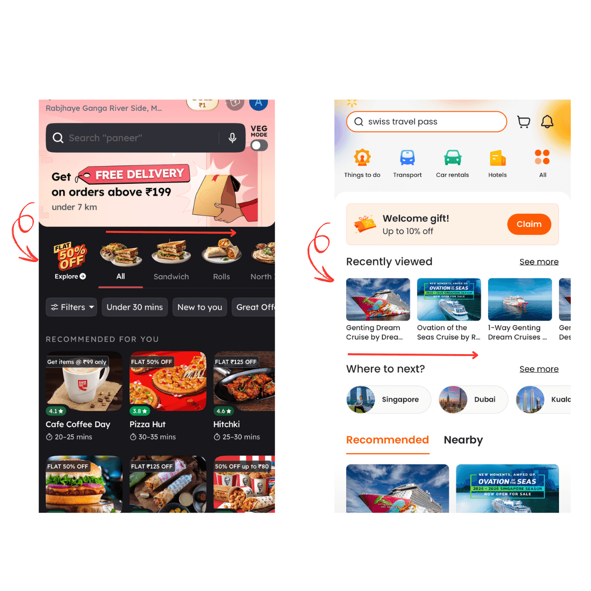
3. Law of Proximity
Objects placed near each other are perceived as related.
Klook clusters similar icons together, and Netflix places episode descriptions and titles near thumbnails. This spatial arrangement helps users understand the content structure quickly.

4. Law of Continuity
Elements aligned along a line or curve are seen as connected.
On apps like Zomato or Klook, horizontally aligned lists and rows guide the user’s eye naturally, making navigation smoother and more intuitive.
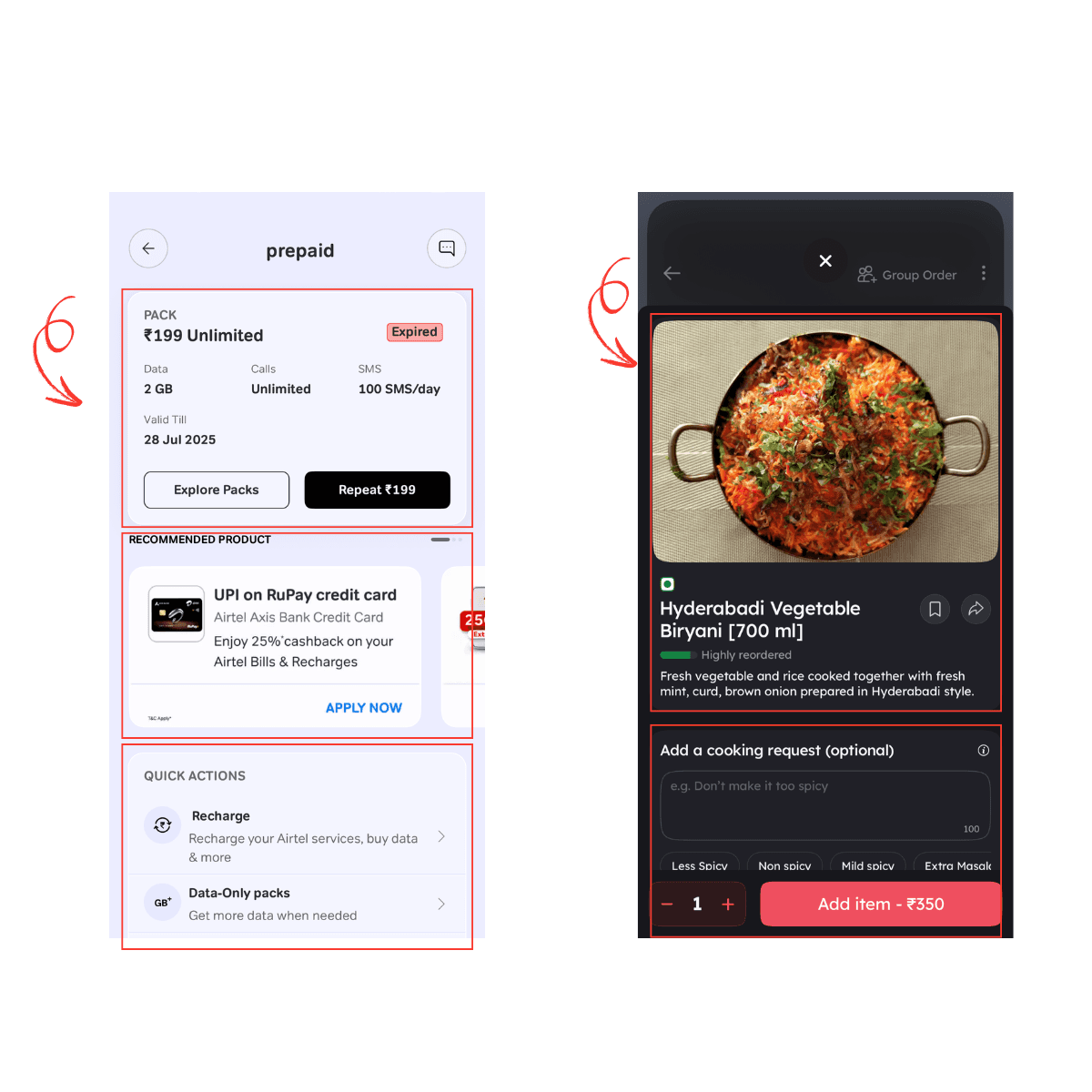
5. Law of Common Region
Elements enclosed within a boundary are viewed as a group.
Zomato uses card-style containers to group restaurant details, while Airtel separates data usage and call logs into clearly defined sections, making it easier to scan and understand.
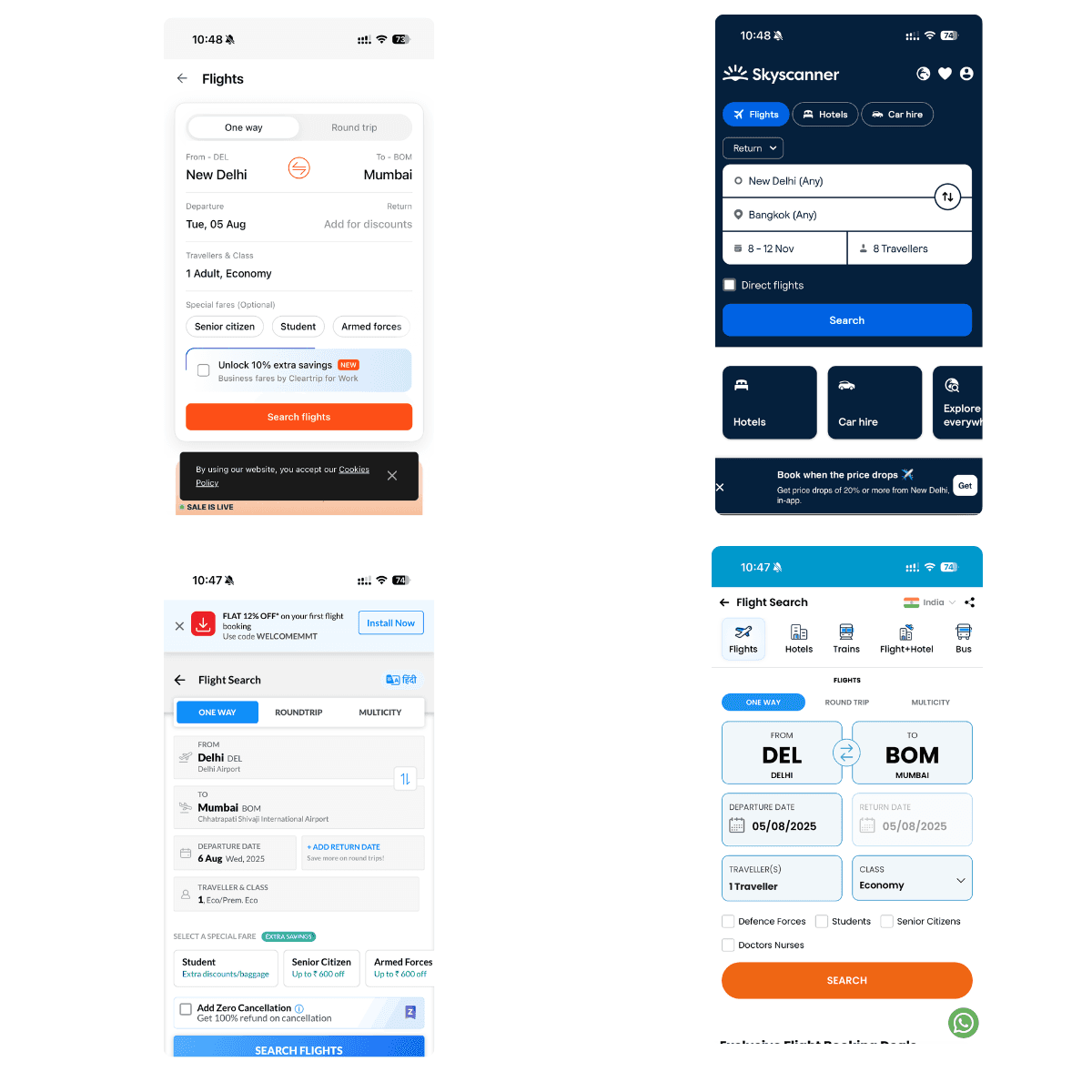
6. Jakob’s Law
Users expect your product to work like others they’ve used.
Most flight booking apps follow a standard flow: From → To → Date → Travelers. This familiar pattern reduces friction and helps users complete tasks with minimal learning.
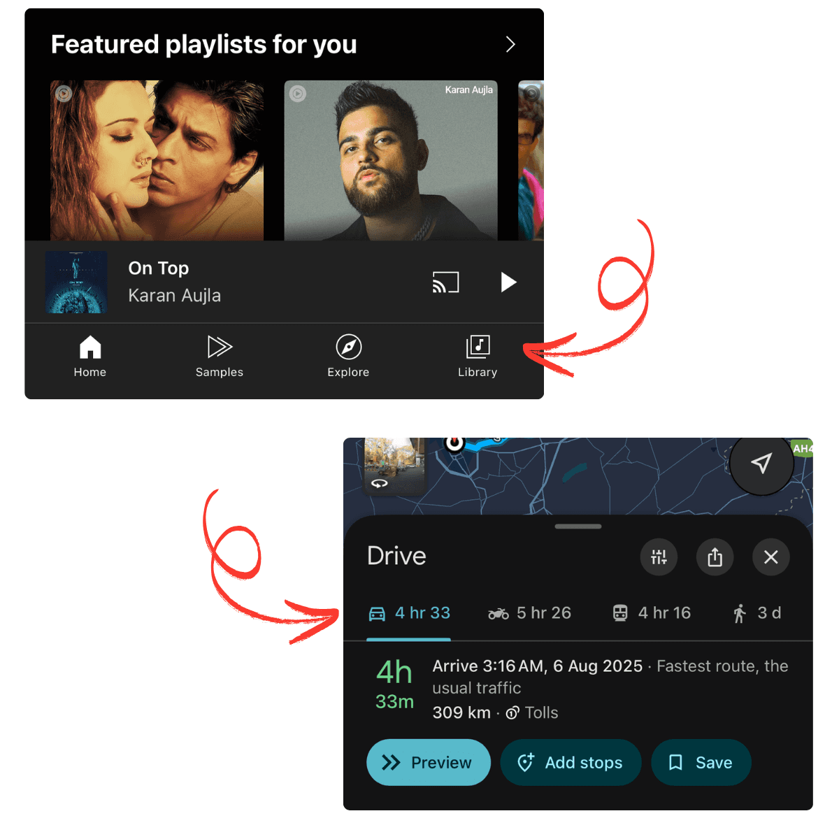
7. Serial Position Effect
People tend to remember the first and last items in a list.
In Apple Music, key navigation items like Home, Explore, and Library are strategically placed. Google Maps highlights top commuting options like Car or Bike ETA at the beginning of the screen.
8. Zeigarnik Effect
Users are more likely to remember unfinished tasks.
Apple Fitness shows progress stats like “16 of 430 KCAL,” encouraging users to complete their daily goal. Netflix keeps viewers coming back with its “Continue Watching” section.

9. Selective Attention
Users may miss what’s right in front of them if it’s not relevant to their goal.
Netflix grabs attention with autoplay previews, while Amazon uses bold banners just below navigation to spotlight trending products.

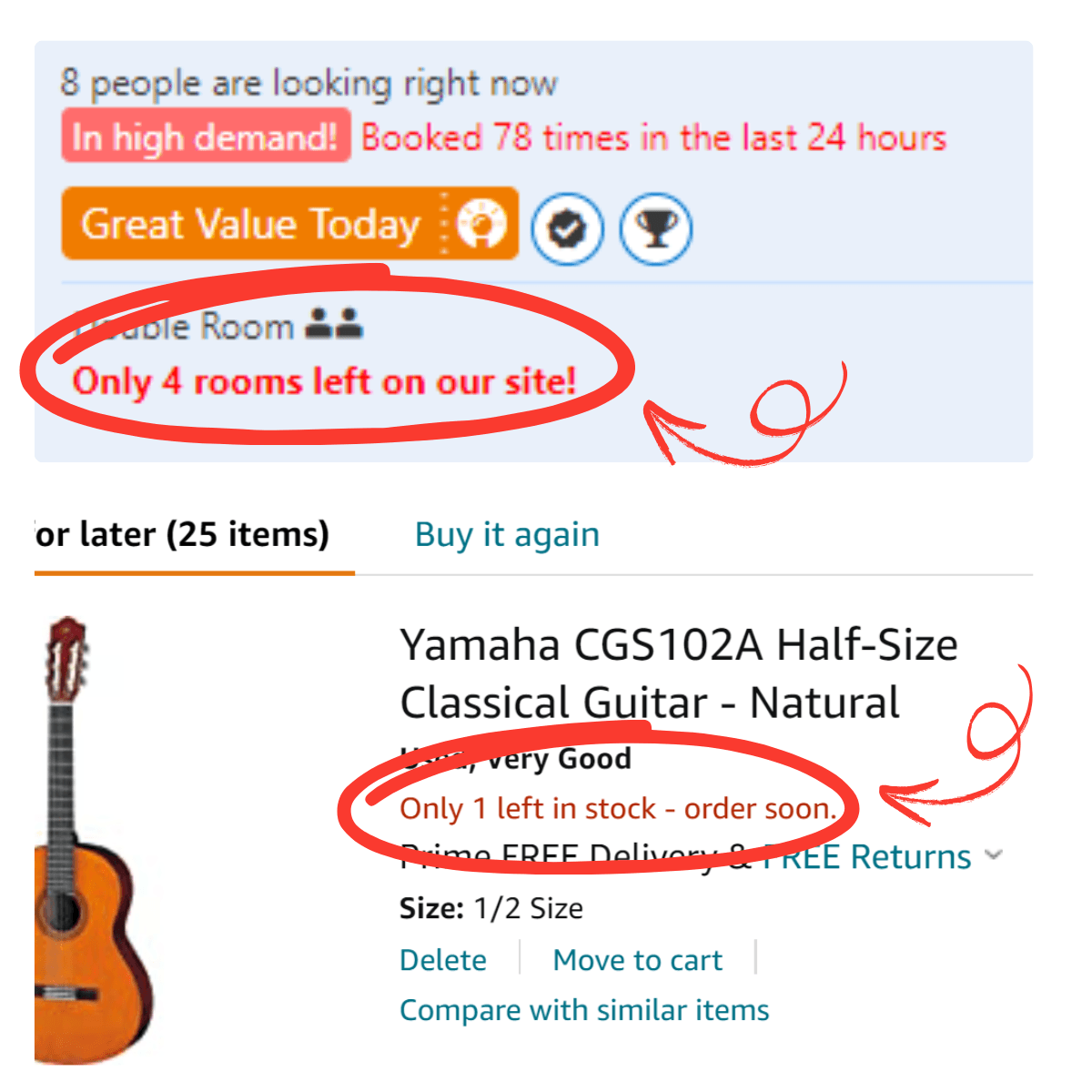
10. Parkinson’s Law
The more time users have, the more time they’ll take.
Creating a sense of urgency helps drive decisions. Booking.com uses phrases like “Only 1 room left!” and Amazon displays “Only 1 left in stock!” to nudge quicker action.
Final Thoughts
These UX laws aren’t abstract theories they’re real behavioral insights used by leading apps to craft better user experiences. By understanding and applying them thoughtfully, you can design products that feel intuitive, efficient, and human-centered.
Design with purpose. Build with psychology.
1. Hick’s Law
The more choices, the longer the decision time.
Users make faster decisions when faced with fewer options. For example, Apple Music streamlines navigation with a minimal number of tabs, while Netflix promotes trending content upfront to help users choose without overthinking.
2. Fitts’s Law
Bigger and closer elements are easier to click or tap.
Gmail’s large, prominently placed Compose button is a perfect example. It’s easy to find and effortless to tap, especially on mobile devices, enhancing user satisfaction.
3. Law of Proximity
Objects placed near each other are perceived as related.
Klook clusters similar icons together, and Netflix places episode descriptions and titles near thumbnails. This spatial arrangement helps users understand the content structure quickly.
4. Law of Continuity
Elements aligned along a line or curve are seen as connected.
On apps like Zomato or Klook, horizontally aligned lists and rows guide the user’s eye naturally, making navigation smoother and more intuitive.
5. Law of Common Region
Elements enclosed within a boundary are viewed as a group.
Zomato uses card-style containers to group restaurant details, while Airtel separates data usage and call logs into clearly defined sections, making it easier to scan and understand.
6. Jakob’s Law
Users expect your product to work like others they’ve used.
Most flight booking apps follow a standard flow: From → To → Date → Travelers. This familiar pattern reduces friction and helps users complete tasks with minimal learning.
7. Serial Position Effect
People tend to remember the first and last items in a list.
In Apple Music, key navigation items like Home, Explore, and Library are strategically placed. Google Maps highlights top commuting options like Car or Bike ETA at the beginning of the screen.
8. Zeigarnik Effect
Users are more likely to remember unfinished tasks.
Apple Fitness shows progress stats like “16 of 430 KCAL,” encouraging users to complete their daily goal. Netflix keeps viewers coming back with its “Continue Watching” section.
9. Selective Attention
Users may miss what’s right in front of them if it’s not relevant to their goal.
Netflix grabs attention with autoplay previews, while Amazon uses bold banners just below navigation to spotlight trending products.
10. Parkinson’s Law
The more time users have, the more time they’ll take.
Creating a sense of urgency helps drive decisions. Booking.com uses phrases like “Only 1 room left!” and Amazon displays “Only 1 left in stock!” to nudge quicker action.
Final Thoughts
These UX laws aren’t abstract theories they’re real behavioral insights used by leading apps to craft better user experiences. By understanding and applying them thoughtfully, you can design products that feel intuitive, efficient, and human-centered.
Design with purpose. Build with psychology.
Table Of Content